| Videos | • Latest |
|
• Feature | • Sports | • Your Videos |
Germany: Innovations make a 'balancity'

A city can only be a good place to live if it strikes a balance between renewal and preservation, innovation and tradition, urbanity and nature, community and individual development, and work and leisure. This is the message of "Balancity", a term coined by German Pavilion organizers to mean "a city in balance."
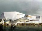
Balancity is shown in the pavilion's architecture. Four huge silver sheets create a roof over the entire German Pavilion. They are offering visitors shade from the sun and protection from the rain.
Besides having a practical purpose, they also reflect a philosophy: the interplay between carrying and being carried, between leaning on and supporting. Each structure is precariously balanced, but when joined with the others, it finally becomes stable.
According to the chief architect of the pavilion, Lennart Wiechell, the pavilion was designed to be a walk-through sculpture with no defined interior or exterior, unlike a "traditional" building.
For visitors, the journey starts with a makeshift harbor, through gardens, parks, a town planning office and factory, past the opera hall and toward a power plant. It's a microcosm of a real city.
The pavilion is Germany's largest ever at a World Expo. It also showcases elements of German urban life and how the country's products and designs can help solve the universal problems of urbanization.
Using its pavilion, Germany wants to show the world it remains at the forefront of technological innovation that features perfect function, world-class aesthetics, better ergonomics, with a strong focus on sustainability.
 0
0 


Go to Forum >>0 Comments